~~~~~~~~~~~~~~~~~~~~~~~~~~~~~~~~~~

Shadow Insanity #1: Infiltration
Sprite Credit
~~~~~~~~~~~~
DeathEgg background: Metallix aka HMS
Shadow: Gabriel aka Frag
Eggrobo: SupaChao
Eggman: Rlan

Shadow Insanity #2: Fight Night
Sprite credits.
Shadow Sprites--Gabirel aka Frag
Eggrobo Sprites--SupaChao
Robotnik Sprites--Rlan
DeathEgg Background--Metallix aka HMS
Badnik Sprites--flampyre

Shadow Insanity #3: Death of the Death Egg
~~~~~~~~~~~~~
Sprite Credit
Shadow: Gabriel AKA Frag
Death Egg & Explosions: supachao
Sky and Green Hill Zone: sonicprime
Sonic: Psyguy
Tails: Frario

Shadow Insanity #4: Collapse
Sprite Credit
~~~~~~~~~~~~~~
Death Egg & Eggrobo: supachao
Ocean: sonicprime
Eggman: Rlan
Death Egg Background: Metallix

Shadow Insanity #5: Wormhole
Sprite Credit
~~~~~~~~~~~~~~~
Shadow: Gabriel AKA Frag
Shadow's House: Domenico
House Interior: Starman.net
Tails: Frario

Shadow Insanity #6: The Plot We All Saw Coming
Sprite Credit
~~~~~~~~
Shadow (Panel 1): PsyGuy
Shadow: Gabriel AKA Frag
Nintendo Background: Spriter Trooper

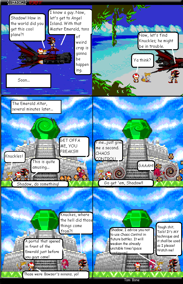
Shadow Insanity #7: Enter Bowser
Sprite Credit
~~~~~~~~~
Shadow: Gabriel AKA Frag
Toad: Oldskoolmario
Bowser: Bacon
Bowser's Castle & Grassland: Spriter Trooper
 BY JERFIED


 Just a few quirks, though. Your panels aren't evenly placed and the lines that divide them aren't thick enough. It might be better to give the boxes black borders but have a little space between each one, say about 2 or 3 pixels thick for both the borders and the spaces. It's so much neater that way and looks a lot better. (Trust me, if I don't point this out someone else will. And you don't want it to be someone who's easily angered by things like this...) Might be better to only show what's needed in your frames too. (eg. in comic #3, the last two frames could be cut a bit at the top because there's no need to see the trees again- they aren't important anymore now that we've seen the ship explode)
 I realize that the comic quality isn't as good as it shoulb be, but I just want people to focus on the comic
  I kept saving it as a .png but it kept coming out as a .jpeg for some reason....weird...and to everyone else, thanks for the comments!